

At NYIP we teach our students a simple Three-Step Method for setting up every photograph they shoot:
- Step 1. Know your subject.
- Step 2. Focus attention on your subject.
- Step 3. Simplify.
This simple Three-Step Method is the secret of every successful photograph ever taken. We teach our students to consider these three steps every time they look into the viewfinder. To consider them before they press the shutter button.
When our students mail in their photographs for analysis by their instructor, the instructor starts by commenting on what we call the three Guidelines. Of course, the instructor analyzes other elements of the picture too — focus, exposure, filters, etc. But the key to every good photo — and the essential element of every great photo — is adherence to these three Guidelines.
How do they work? How can you apply them? It's beyond the scope of this Web site to teach you every nuance, but you will get an inkling from the Photo of the Month Analysis that follows.
Bridesmaid
Photo by NYIP Graduate Ludmila Popova
This month's picture, made by NYIP Graduate Ludmila Popova of Overton, Kansas, celebrates the joy of youth as well as the joy of marriage. We see what appears to be a young bridesmaid, perhaps a sister, cousin, or niece of the bride, perhaps participating in her first wedding as member of the bridal party. She clutches the bouquet (with both hands!), her faced wreathed in smiles.
As always, we look for the application of the three NYIP Guidelines: strong subject matter, focusing attention on the subject, and then simplifying the picture by eliminating the unnecessary and retaining what is needed. The subject is joy. The means used to portray this include the Rule of Thirds, good timing to get the right expression, light and dark tonalities juxtaposed, and so forth. Simplicity has been achieved by confining the pictorial elements to the smiling girl, her bouquet, the bench, her long gown (possibly her first one?), and the rather stark dark background.
Let's look at the light and dark tonalities first. There are two ways to achieve contrast between light and dark. The first and possibly the more familiar one is the placement of well lit areas next to areas in shadow, a situation all too obvious on a bright sunny day. Or in a darkened room lit only a single light such as a table lamp or a candle. This configuration, in the art world, is called chiaroscuro — Italian for light and dark.
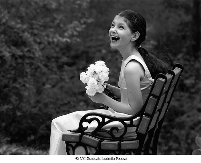
But all this depends on the appearance of a bright sun. How does a photographer achieve the effects of light and dark when there is no bright sun? Ludmila Popova has shown us the way by the use of notan — a Japanese term. Notan is the juxtaposition of light and dark but without the obvious sun and adjacent shadow. She has photographed the young bridesmaid on what appears to be an overcast day , hence no sun and deep shadow, and yet the contrast of light and dark comes from the objects themselves rather than from the light source. Look at the white bouquet next to the dark surround. Look at the white gown against both the surround and the dark bench. Look at the dark hair against the light skin, the light skin against the dark bench, etc. Much contrast here and yet no obvious sun and shadow effect. This is notan.
I mentioned earlier the use of the Rule of Thirds, and I want to discuss this concept here because of a misconception that sometimes appears in our students' work. The photographer, Popova, has used this "Rule" (really just a suggestion) well. Note that she did not place the subject way over to the right. It is only the outside edge of the subject that should be placed on the 1/3-2/3 dividing line. You should not place the entire subject within that framework, a mistake too often made. If you place the entire subject in that limited framework you give the picture a decidedly lopsided look. So we see that the photographer placed the girl's back on the 1/3-2/3 line, and that's enough.
Now a word about the surround (or background, if you prefer). Note that is not a solid tonality of dark gray. There are flecks of light here and there, light reflecting off the leaves, and those patches of light relieve the monotony of a solid background tonality. There's a lesson to be learned here. Some students use a solid background tone in studio portraiture when perhaps it might be more interesting to throw a little bit of light on the background or incorporate some minor variations in the background tone.
I particularly like the way that individual areas within the photograph have their own special interest. That is, these are areas that can stand on their own as points of interest without the support of the rest of the composition. As an experiment, see how many interesting photographs that you can make from this relatively simple composition.
Look at the head and neck alone. A good photograph, certainly. The hands and the bouquet. The elbow and fore arm. The same area coupled with arm of the bench. The arm of the bench and seat of the bench alongside the thigh and knee. The back of the chair next to the girl's back. Her shoulder inside the arm hole of the gown. All interesting compositions within the framework of the greater composition.
Ludmila Popova has created a highly artistic rendition here, don't you think?


