

This month, we're glad to note that NYIP Contributing Editor Richard Martin has graciously provided us with his analysis of a provocative student photograph. Students who have had the good fortune to work with Richard know that he has a keen eye and knows how to get to the bottom of what works in a photograph, and how subtle changes can affect the image's meaning..
At NYIP we teach our students a simple Three-Step Method for setting up every photograph they shoot:
- Know your subject .
- Focus attention on your subject.
- Simplify.
This simple Three-Step Method is the secret of every successful photograph ever taken. We teach our students to consider these three steps every time they look into the viewfinder. To consider them before they press the shutter button.
When our students mail in their photographs for analysis by their instructor, the instructor starts by commenting on what we call the three Guidelines. Of course, the instructor analyzes other elements of the picture too – focus, exposure, filters, etc. But the key to every good photo – and the essential element of every great photo – is adherence to these three Guidelines.
How do they work? How can you apply them? It's beyond the scope of this Web site to teach you every nuance, but you will get an inkling from the Photo of the Month Analysis that follows.
Photo of the Month, "Freshly Squeezed Orange Juice the Hard Way!"
by NYIP Graduate Edward Mineer
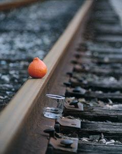
Who says that photography has to be deadly serious? Not me! This amusing image by NYIP Graduate Edward Mineer really tickled my funny bone. Let's take a look at it in detail.
What is the subject? That's pretty straightforward as there are only three elements in the image – the orange, the glass, and the railroad tracks. Taken together they represent the subject. Remove any single element and you have no picture, at least not one that has meaning. Speaking of meaning, is there anyone viewing this photo who does not understand what is going on here? Perhaps there is. After all, not every culture has orange juice on the breakfast menu.
How did the photographer draw attention to the subject? Both the orange and the glass are in the foreground and are the only elements that are really in sharp focus. Additionally, the orange is the only prominent color here. Your eye is just naturally drawn to it. By the way, this photo is an excellent example of the Rule of Thirds. More of a guideline than a rule, but placing the subject off-center usually results in a more dynamic look. We encourage our students to use this principle, though occasionally they will assume we mean EVERY photo should be composed that way. There are exceptions to every "rule" but such placement works very well here.
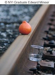
Could the image be simplified in any way? Are there any distracting elements that don't belong? Well, some might argue that we don't need all those railroad tracks off in the distance. Why not crop the photo a bit, as I have done here, to really zoom in on the orange and the glass. A lot of images can be improved by some judicious cropping; though that is best done when you are composing the shot in the camera's viewfinder, rather than after the fact. Does cropping improve THIS image? Maybe, but personally I like those tracks converging in the distance. I believe they add a little tension and anticipation to the scene. "When is the train coming?" I think to myself as I look down the tracks. "I want my OJ now and that orange isn't going to sit there forever!"
I suspect many people looking at this photo would wonder if the mechanism of the orange, tracks, and glass would really accomplish what the arrangement suggests – make juice. Of course, there's a missing element, the train; but personally I don't think this would work. More likely, the orange would be obliterated and vibration from the train would knock the glass over. I wonder if the photographer actually tried it.
However, I really like this photo. We all could use a chuckle now and then and this image is certainly "mirth-making". Besides, the simplicity of it appeals to my minimalist sense. I confess to a bias against overly "busy" photos, though sometimes I am guilty of violating my own "rule" about that. I congratulate Edward Mineer on a successful realization of his creative (and funny) vision.


