

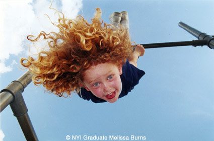
Photo by NYI Graduate Melissa Burns
I have been reviewing NYI student photographs for nearly 23 years now, time enough, I'd say, to indicate that I know what I'm doing. At least, I hope so. And, if not, maybe it's time to relax in a rocking chair, put a shawl over my shoulders, a comforter across my knees, and doze off in front of the fireplace. "Dreaming dreams no mortal ever dared to dream before", as Poe said in "The Raven". But Dylan Thomas said "do not go gentle into that good night; rage, rage against the dying of the light." And so again I try my hand in a critique of a photograph.
It isn't easy, you know. A critique that's too harsh can be poisonous to the student and also to others who view the picture. But a bland weak-kneed evaluation doesn't do much either except to prevent the student from understanding how truly bad the photograph is. It's damning with faint praise, as they say.
I think the right approach when writing a critique of any kind, of photographs or otherwise, is fairness. Pointing out what is strong in the picture, noting whatever is weak, and generally leaving both the student and other viewers with good feelings about the picture. Neither praise to the sky nor crucifying, for either extreme is usually unjustified in most cases.
So, with those thoughts in mind, let's have a look at this Picture of the Month, created by NYI Graduate Melissa Burns of Burbank, California. But first, brief mention of the NYI Guidelines: strong subject matter, focusing of attention on the subject, and then simplifying the picture by eliminating the unwanted items and retaining the necessary ones.
Let's explore the applications of each of these guidelines.
What is the subject? I suppose that we might over intellectualize this photograph, but let's keep it relatively simple. I think that all good photographs should be relatively simple, not simple minded but simple. That is, we should be able to determine the theme or subject without a great deal of angst, omphaloskepsis, or soul searching. How about "Performing on the Horizontal Bar?" That's simple enough, no?
So in one fell swoop and without undue wringing of hands I have pinpointed the strong subject matter. Now to the nitty-gritty. How did Melissa Burns focus attention on the subject?
She's not a magician, skilled in levitation, but she did manage (with the aid of fill flash) to get the small girl up in the air on the high bar and hold her there for a split second. In reality, no mean feat (no mean feet?). In photography, easily accomplished.
Those of you who have studied Unit Two in our Complete Course in Professional Photography are familiar with our analysis of the Rule of Thirds. Here's a good example — the little girl placed well off center. Try to imagine the child placed directly in the center of the bar, not bad but with less tension and excitement, too.
And now I have arrived at the Third NYI Guideline — simplify the picture by retaining what is necessary and eliminating the unneeded. The needed items are obvious, child and horizontal bar, the sky above. And there's the delicate point: cropping. There are two kinds of cropping, really — cropping to remove unsightly elements and cropping to alter the original concept of the picture.
In the first case I am talking about removing the telephone pole from the top of Aunt Clara's head. Obviously the pole shouldn't be there and should be removed. Some may think that Aunt Clara's head should also be removed, but I think that's unchivalrous. But what about cropping that may greatly alter the photographer's original intention? Am I taking liberty with another photographer's work and do I have the license to do this?
The late great Henri Cartier-Bresson permitted no cropping of his photographs in any way. This was unequivocally stated in his agreement with publishers, galleries, museums, and the like. But lesser photographers are at the mercy of art directors, editors, and so forth.
At the risk of offending Melissa Burns I am going to suggest some cropping of her photograph that will entirely alter the original concept. She has beautifully shown the child performing the kip or the giant swing on the horizontal bar. But I'm proposing to crop out all semblance of the bar, thus leaving the little girl flying through the air (with no visible means of support.) I have added nothing to the photograph of my own invention. I have only removed some of Melissa's concepts. But I surely have made a departure from reality.
Is this fair? You be the judge. I looked at the child's hair, resembling somewhat the head of the Gorgon Medusa and thought that I could add to the sense of mythology by having Medusa fly through the air. And so I eliminated the steel bar structure. cropping, as you can see, is highly subjective.
But it is often a major element in our Third NYI Guideline — simplifying the picture.
Turn attention now, if you will, to the catch lights in the eyes. Their central position in the eyeballs give the child a somewhat dazed, almost zombie-like appearance. This is caused by the fill flash being on the camera or very close to it. The result is the inevitable flat harsh look. It would have been better from an aesthetic point of view to get the flash off the camera and well away from it with the result that the catch lights would appear higher in the eyeballs with a more natural look. Yet I have, through my own cropping, made the child into a flying Medusa. Is not the zombie-like appearance of the eyes in keeping with my mythological interpretation? I think so.
Remember what I said earlier in this article that I did not intend to praise unduly; nor did I intend to crucify. I wanted to be fair. So, my general feeling is that this is a good photograph but also that there is room for improvement. Perhaps even Beethoven felt the same way after composing his Ninth Symphony, perhaps the "Ode to Joy" needed a little tweaking.


