

"The colors in my prints don't match the colors on my computer monitor" is a complaint we often hear from students. The solution, in a nutshell, is a color-managed workflow. But before we get into the specifics, we want to briefly explore the nature of color itself.
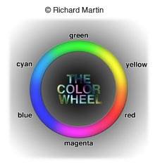
What is color? Well, color is that part of the electromagnetic spectrum that human vision can see. But there are three elements to consider and understand. First, the light source. Color has often been described as light and the nature of the source definitely influences our perception of color. Most people know that objects illuminated by daylight look different from objects viewed under an incandescent light bulb, color-wise. Daylight itself, of course, varies, with sunset/sunrise colors generally much "warmer" in appearance than midday. "Warm" and "cool" light sources can be characterized by their color temperature. Warm sources have a low color temperature (an ordinary 100 watt light bulb is about 2900 K) while cool sources have a high color temperature (open shade on a clear blue-sky day might be as high as 12,000 K, though in a narrow technical sense, the blue sky has no color temperature). While this arrangement might seem counter-intuitive to you (2900 is warmer than 12,000?), it does give us a useful guide to understanding light sources and their color emissions.
Second, the nature of the object being viewed. A red apple appears red because it reflects red or more accurately, long wavelengths of light while absorbing the other wavelengths. The physical characteristics of the object determine this.
Both the first and second elements can be precisely described scientifically and up to a point, color management can be too. But when it comes to the third element, the human observer, things get a bit dicey. Human vision, which encompasses both the eye and the brain working in tandem, is a wonderfully complex system. It's very adaptable too, especially when it comes to color perception. And perception is the operative word here.
No two people see the color red exactly the same way. To make matters worse, we tend to see the colors we expect to see. All this can play havoc with our photography but happily the situation is not hopeless.
Ok, enough theory. Some folks will say I have oversimplified things but I said I would make this easy. Let's get to it.
There are a minimum of four factors that have to be dealt with when constructing any color-managed workflow – a calibrated computer monitor, an ICC-aware image editor (I'm going to discuss Photoshop CS2 here), tagged image files, and printer profiles. Let's take these in order.
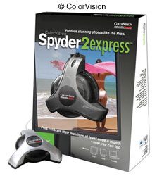
Calibrate your monitor. I repeat, CALIBRATE YOUR MONITOR and do it periodically, perhaps once a month. How? Well, first of all, forget Adobe Gamma, that cheesy "calibration" program that comes with Photoshop. It's almost useless. I hate to think of all the students who told me that their system (and prints) looked WORSE after running that program. You need hardware calibration. For the purpose of this article I utilized the new ColorVision Spyder2 Express, a very inexpensive calibrator that's aimed at folks who are new to color management (I assume this means you). It lacks certain advanced features found on the "pro" versions but if you don't have a high-end professional monitor, the latter are probably a waste of money. There are of course, a host of other calibration tools available on the market too, all of which will get you to the same point – a well calibrated system with accurate color.
The step-by-step procedure is pretty straightforward. After turning on your monitor and allowing it to warm up for an hour or so, just follow the simple directions. The program begins by asking a few questions, like whether you have an LCD or CRT monitor. It even has a little picture of each type in case you don't know the difference. If you have the latter, Express will then inform you that a color temperature of 6500 K and a Gamma of 2.2 will be set. Gamma is beyond the scope of this discussion but essentially its value affects the brightness of colors. MAC users may insist that 1.8 is better for them but most authorities claim that's only true in a non-color-managed system. My advice – don't worry about it.
The next step is a little tricky. You are going to set the white point by adjusting the contrast and the black point by adjusting the brightness controls on the monitor (CRT) and you do this while looking at four white blocks and then four black blocks. The controls on a LCD monitor are a little different from those on a CRT but the principle is the same. Just be sure you select the correct monitor type at the beginning and you'll be fine. The contrast on most CRT's should probably be set at maximum but the brightness can be problematic. Express suggests you begin by setting the monitor at the factory default for brightness. If you can't figure that out, just use a middle setting and go from there.
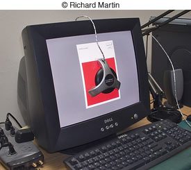
This is the only part of the whole calibration process that depends somewhat on your eyesight and how you perceive those blocks, especially the black ones. The next stage, calibrating the RGB (that stands for Red, Green, and Blue, in case you are REALLY new at this) settings, is automatic and is achieved via the Spyder tool that you attach to your monitor screen. This device is connected to your computer's USB terminal.
At the end of the process, Express will display a page of images and you can compare the view before and after calibration by toggling between the two.
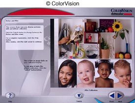
The difference may be dramatic or it may be subtle but I guarantee you will see a difference. It will also tell you the name of the profile and where on your computer system it was installed. On Windows XP machines, its location is Windows\System32\Spool\Drivers\Color and the file name is Spyder2Express.icm. If your operating system is XP and are curious about what you currently have by way of profiles, check it out. They'll all be in the same location. By the way, each time you calibrate your monitor, this file is overwritten with a new profile.
Ok, next we need an image editor, like Photoshop, that can utilize ICC profiles. ICC, by the way, stands for International Color Consortium – nice to know if you ever encounter a crossword puzzle whose theme is digital photography. Profiles are important because they help ensure correct color reproduction from screen to print via the image editor. If you let the printer driver deal with color management, the appropriate profile will be selected there, usually associated with a particular paper. ICC profiles, however, may be different from the generic ones that were installed with your printer driver and you usually have to acquire them separately. But this is a color management system we are discussing so we are not going to let the printer driver take control. More about that later.
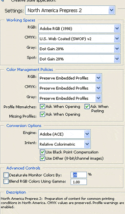
Next, we want to use image files that are tagged with a specific color space. The most common ones are sRGB and Adobe RGB (1998). The former is best if the Web is the intended destination of the photo. For printing, use Adobe RGB (1998). A color space, essentially, is the range of colors that a device (camera, printer, monitor) can utilize and these are a kind of profile too. They can be assigned in Photoshop by clicking on Edit, then Assign Profile. A drop-down menu will then appear with all the profiles available and you simply click on your choice. The better digital cameras offer you a choice of color space right in the camera. Mine don't but I routinely shoot RAW with my digital cameras and it's in the RAW converter where I set this. But I sometimes assign profiles to "old" digital files that are untagged so that they will fit into my color-managed workflow. By the way, I also adjust the color settings in Photoshop to the Adobe RGB (1998) space.
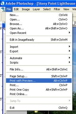
Finally, printer profiles and here's where it all comes together. I'm using an Epson 2200 with ICC profiles that I downloaded from Epson's website and the one I use most often is associated with Epson Velvet paper. How? Well, after loading the paper (one sheet at a time from the back of the printer; Velvet is too heavy to pass through the top without damage), I open the image I want to print in Photoshop CS2. Then, click on File, then Print With Preview.
This opens a dialog page with lots of interesting choices. I set the following: Color Management and Document (there should be a profile next to it).
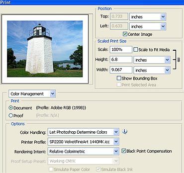
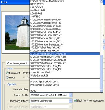
Under Options you have three: For Color Handling I select Let Photoshop Determine Colors, for Printer Profile I select the specific ICC profile I'm going to use from the drop-down list, and for Rendering Intent I select Relative Colorimetric with the Black Point Compensation box checked. Relative Colorimetric tends to preserve more of the colors in the original image and I routinely choose this. But some folks swear by the Perceptual setting so if you want to experiment, try them both. As for Black Point Compensation, Adobe says it's useful for adjusting black point differences between the document you are printing and the printer. Sounds good to me so I check that.
Then I click on Print. This will open your printer driver. If you have more than one printer connected to your computer, make sure you select the right one.
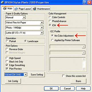
The final step is very important. Make sure you set the printer driver for No Color Adjustment. This is critical. The accompanying illustration shows what this looks like in Windows with the Epson 2200 but your printer will have something similar even if it's not an Epson. Don't forget this or the resulting prints will look horrible.
If you have followed these steps carefully, you should see a print that closely matches the colors on the screen. But keep in mind that color management simply ensures that match. It won't FIX color that needs to be adjusted in the original. If the original image has a blue color cast, for example, so will your print. You need to correct that in Photoshop first.
Does everyone need color management? Not necessarily. If you are happy with the prints you are currently getting and you are working in a "closed" system (camera, computer, and printer are all controlled by you), you might not want to change anything. I'm a big believer in the old adage, "if it ain't broke, don't fix it". For years this was my setup and I was loathe to tinker with it. Furthermore, color management won't have much impact if your images are destined for the Web. The wide differences in monitor and browser settings make it impossible for everyone to see the same thing. Then too, your ISP can influence your images' appearance. For example, AOL sometimes does some "interesting" things with colors.
But I think most photographers will benefit from a color-managed workflow. Good color along with the right amount of brightness and contrast are a joy to behold. And you'll love how much less paper and ink you waste.


