

 We received lots of intelligent feedback from our readers about the article we ran about Barack Obama’s official Presidential portrait, and most of the responses found the portrait wanting. Space prevents us from running all the comments we received, but here are some of the most interesting, roughly in the order that we received them.
Before we turn this over to our commentators, it’s worth pointing out that the 2009 Pulitzer Prize for Feature Photography was awarded to New York Times staff photographer Damon Winter. The Pulitzer citation is simple and direct:
"Awarded to Damon Winter of The New York Times for his memorable array of pictures deftly capturing multiple facets of Barack Obama’s presidential campaign. Check out the official page at www.pulitzer.org".
We should also point out that each year there are two Pulitzer Prizes for newspaper photography, one for Feature Photography and one for Breaking News. This year’s Breaking News winner, Patrick Farrell of the Miami Herald, covered the devastation of last year’s hurricane season in Haiti. In fact, if you click around a bit, you’ll find a lot of great photography on the Pulitzer Web site in the two categories over the years.
At the risk of one more delay before we get to the comments, recently, to coincide with the 100-day tenure of President Obama, Pete Souza sat for an interview with CNN and discussed some of his favorite pictures. He's clearly a photographer who likes to work in a candid, photojournalistic mode. Take a look here.
Marcus Embrey wrote:
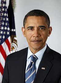
"First thing, I would have chosen a completely different background, something a little darker. This will be what is hanging in 10,000 different locations. The vast majority will be at every turn in Federal hallways. Immediately my eyes focus hard on the wall then what has become secondary focus of interest (due to the aggravating wall) President Obama. That wall makes me think the picture could have very well been taken in a Federal building hallway and received the same effect.
I would have not softened the American Flag as much. The President must stand out from everything else in the picture but then the secondary focus would obviously the Flag of the United States of America."
Jorge Velez did some looking around to inform himself before he sent in his comments:
Good evening,
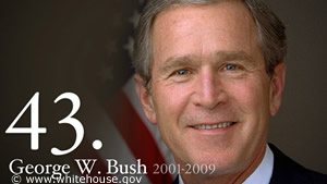 I have to say that when I first saw this photo online, I thought that it was just a temporary photo that was taken quickly once President Obama was elected. I did not realize that this was, indeed, the "official" portrait. I first saw President Obama’s photo on the White House website where all of the president’s photos are posted and I just thought to myself that no one had a chance to post a new photo yet. I looked over the photographs of the previous presidents and even though according to your article by Mr. DeLaney says that President Bush’s smile seems a bit forced, I honestly feel that it is one of the better portraits. It has a very clean look to it with a gray background really blending the color of his skin nicely. The lighting reflected in his eyes is not nearly as strong as President Obama’s.
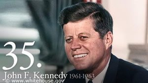 Speaking of backgrounds, I do not agree with a white background for President Obama. There should have been some sort of differentiation in the background. I love on-location photography more than in studio, which is why of all of the president’s photos I have seen on the White House website, I especially like President Kennedy’s photo. The æ profile adds so very much with him looking off to the side away from the camera. He looks so approachable as a president, as if he is happy to see you.
I feel that a different "official" president should be taken.
Richard Heath didn’t mince any words:
To be honest, this is a technically poor photo. I cannot believe it was done by the official White House photographer. It goes to show that not all photojournalistic photographers do well as portrait photographers. If I were Mr. Souza, I would be ashamed of this work. It is simply inexcusable! I wonder how the powers that be chose the "official" white house photographer?
Mr. Heath is one of those individuals who appends a quotation to his e-mail signature, and the quote he has chosen gives you a sense of how he feels about photography:
"We don't make a photograph just with a camera; we bring to the act of photography all the books we have read, the movies we have seen, the music we have heard, the people we have loved". -Ansel Adams
Charles A. Wood provided his top nine suggestions:
- Depth of field is too short — both flags should be in sharp focus, the Presidential seal should be clear.
- Lighting is poor — should remove the shadows on the left side of his face.
- Need to move him to his right — closer to the flag vertically.
- Cropping of the top the flags is poor — show it or cut it out.
- He does not look relaxed — also, face looks drawn, vertical line in neck gives impression of "turkey neck" — tell him a joke (about Biden)!
- Facial expression is too serious, need to show that famous smile — portray inner joy at being the President.
- Collar looks a bit loose and tie appears either not centered or tied poorly.
- Back to lighting, which increases the depth of eye sockets (especially his left eye), complicating his morose image.
- Back to the face — why isn’t he looking at us? Regardless of the angle — image could be misperceived, that he is hiding something.
Jim Lowell looked at the portrait and offered two thoughtful perspectives:
Although I’ve been active in photography for 45 years, I’ve never been a portrait photographer; so, my comments come from two different perspectives: As a reasonably skilled general photographer and as an ordinary citizen looking at a portrait of his president.
The Photographer’s point of view
Using NYIP’s Three Guidelines, (Know your subject; Focus attention on your subject; Simplify) the official presidential portrait gets a "B+." But, going a step further, which I would think the President’s official portrait would require, we need to ask, does this image draw the eye, hold my attention and allow me to walk away satisfied that it was the best portrait that could have been taken to represent the leader of the United States? On these three counts, at best it gets a "C."
First, does it draw the eye: not particularly; it’s a lovely portrait of a handsome man, but there is nothing that calls out "look at me." Does it hold my attention: no; I agree President Obama has a distant look in his eye, but unless I’m an editorial writer, that doesn’t mean to me he’s a visionary seeing an unknowable future. Rather, it suggests he wasn’t sufficiently engaged in the photo shoot. In addition, although the background is slightly shaded, the shading is upside-down: It’s lighter below his shoulders than above, exactly the reverse of what it should have been, particularly with a darker-skinned individual. Finally, would I walk away satisfied; frankly, I’d walk away indifferent.
The Ordinary Citizen’s Point of view
As an ordinary Joe (actually a Jim), I want the image of my leader ? seen across the world ? to be a compelling one. I want it to inspire respect and high regard for the man in the portrait (and, by extension, his country). I feel, at best, President Obama’s official portrait shows a thoughtful, competent, confident, relatively young man who I’d enjoy having to my home for dinner.
At the very least, I would have liked the President to be making eye contact with me (rather than the future). Most likely, putting President Obama at an angle, and having him turn back toward the camera could have helped accomplish that.
Recognising Mr. Souza had very little time with a president-to-be, whose mind would have been otherwise engaged (and who I doubt was told the importance of this photo shoot), I’m sure he did the best any of us could have done. But the image still leaves me wanting more.
Ron Thorpe echoes Jorge Velez, adamantly demanding a reshoot:
There is only one thing to say — DO IT AGAIN !!!!! We have all seen President Obama numerous times on TV and this portrait in no way captures the intellect, honesty and humor of the man.
John Fischer takes the brave step of coming upon a subconscious association he’s making with Obama’s facial expression:
Obama is a pretty photogenic guy, and there were a lot of great photos of him during the election, but this is not one of them. I picture Obama as a friendly guy, someone you might like to have a beer with, but I'm familiar with this expression: that of an irritated school teacher, and that is not a smile. I see pursed lips. Technically is photo is ok, but I think the left side of his face is a little too dark. Overall, the photo is dour and uninspired. In fact, the more I look, the more he reminds me of my high school principal.
Alice Galeotti, as if on cue, picks up on the pursed lips observation:
The bright background makes it look more like a passport shot than a Presidential portrait. Pursed lips and closed smile convey an air of secretive mirth instead of confident strength. Honestly, I'm no Obama fan to begin with so my critique is bound to be on the negative side no matter what the portrait. Still, I believe a better portrait could have been done.
A commentator with a one-word name, Rjwagons, had this to offer:
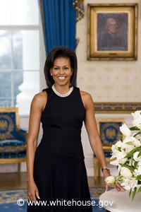 While Obama is very photographic — and it is a nice photo — to me it seems a bit amateurish - not as classy as a presidential photo should be. The background bothers me more than the uneven shoulders. I felt the same way about Michelle's official photo. She looked beautiful, but the shot looked too casual with the background not properly "lined up."
Paul Ronayne, writing from the United Kingdom, views the portrait as a missed opportunity:
I can, perhaps, give an outsider's opinion of Barack Obama's official portrait. Obama is quite simply the most camera-friendly president since JFK. He's at his best when he is smiling, relaxing and meeting people. He has just visited my country, the United Kingdom and believe me the media response has been incredible. This official portrait is the first picture I will see when I enter your country and I will see it again and again in Government, State, Military and Diplomatic offices throughout the world. So why do I dislike it? Well, this is not a picture of the president that I and millions of others recognise. Obama appears uncomfortable and ill at ease: a great contrast to his public image. There is a simple picture of him in my local library extolling the virtues of children visiting libraries. He is relaxed, smiling, with his arms folded standing on the steps of Congress and everyone, young and old go and and examine this poster. I wonder what relationship he had with the photographer of that picture? One perhaps that we all know, an easygoing, relaxed and informal one between photographer and subject-the way great portraits should be made. This was a fantastic opportunity to break with the past, an historic and groundbreaking presidency deserves a special portrait. I'm afraid we didn't get one.
We give the last word to a current student, Jerry Paskowitz, who is still sharpening his skills, but who did a quick reworking of the image:
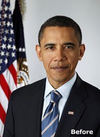
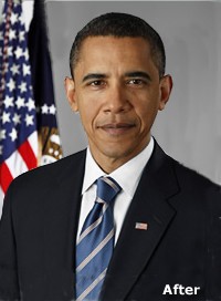
While not a graduate yet, I would like to respectfully offer my comments. I find the shadow just to the right of the flag disturbing and distracting. Obama should have been positioned more to his right, closer to the flag. The fact that the flag fills the entire left side of the frame and the space above the Prez's head gives the impression that he is short. The flag is not bright enough and his shirt is too drab. There also should have been more contrast with the background. I have attached my version of how the portrait SHOULD have looked.
Yours truly,
Jerry Paskowitz
Thanks to everyone who took time to share their thoughts with us.


